Popover
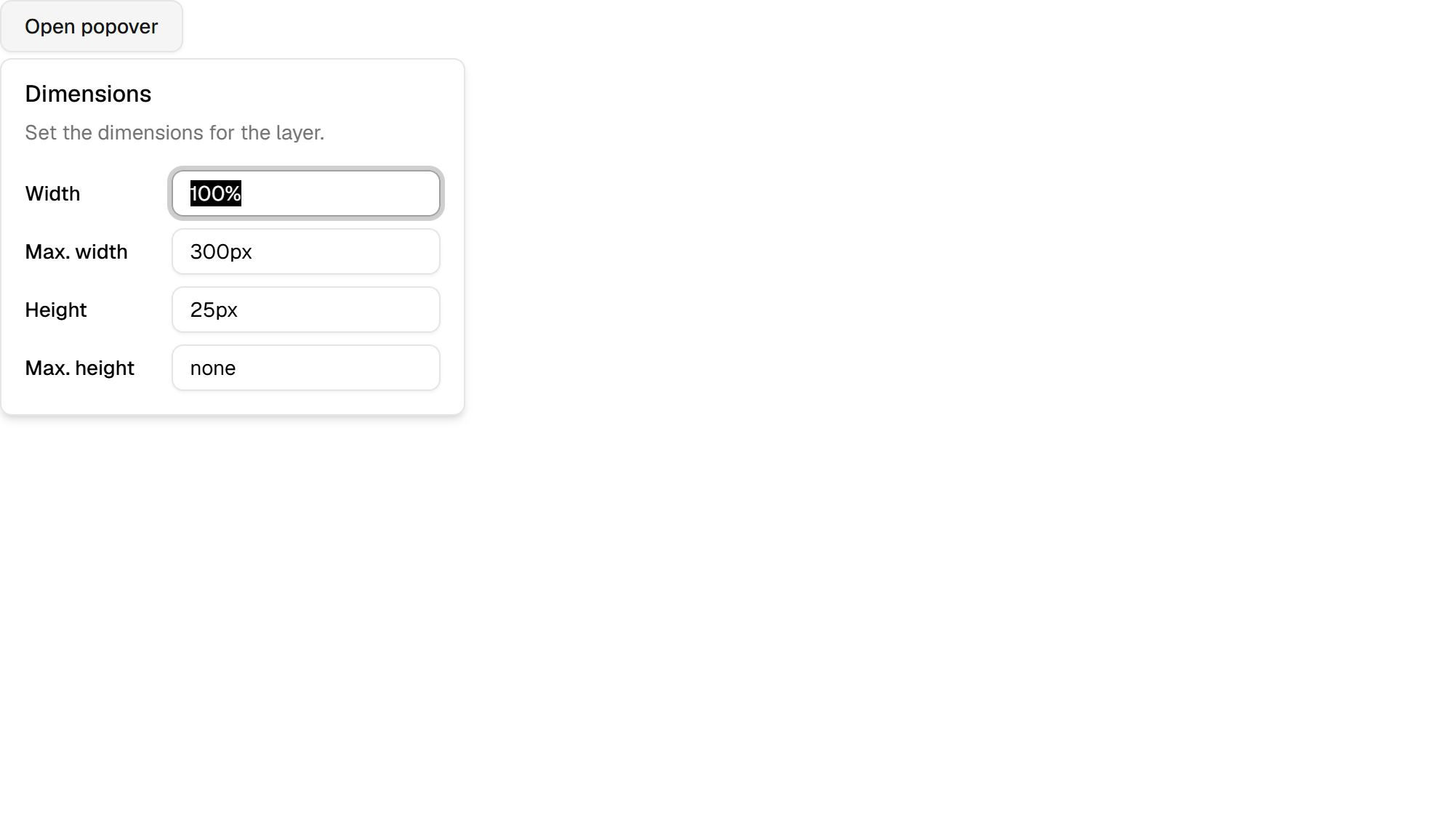
Popover is a overlays component for React and Tailwind CSS. Included in SexyUI Pro, a one-time purchase.
About overlays
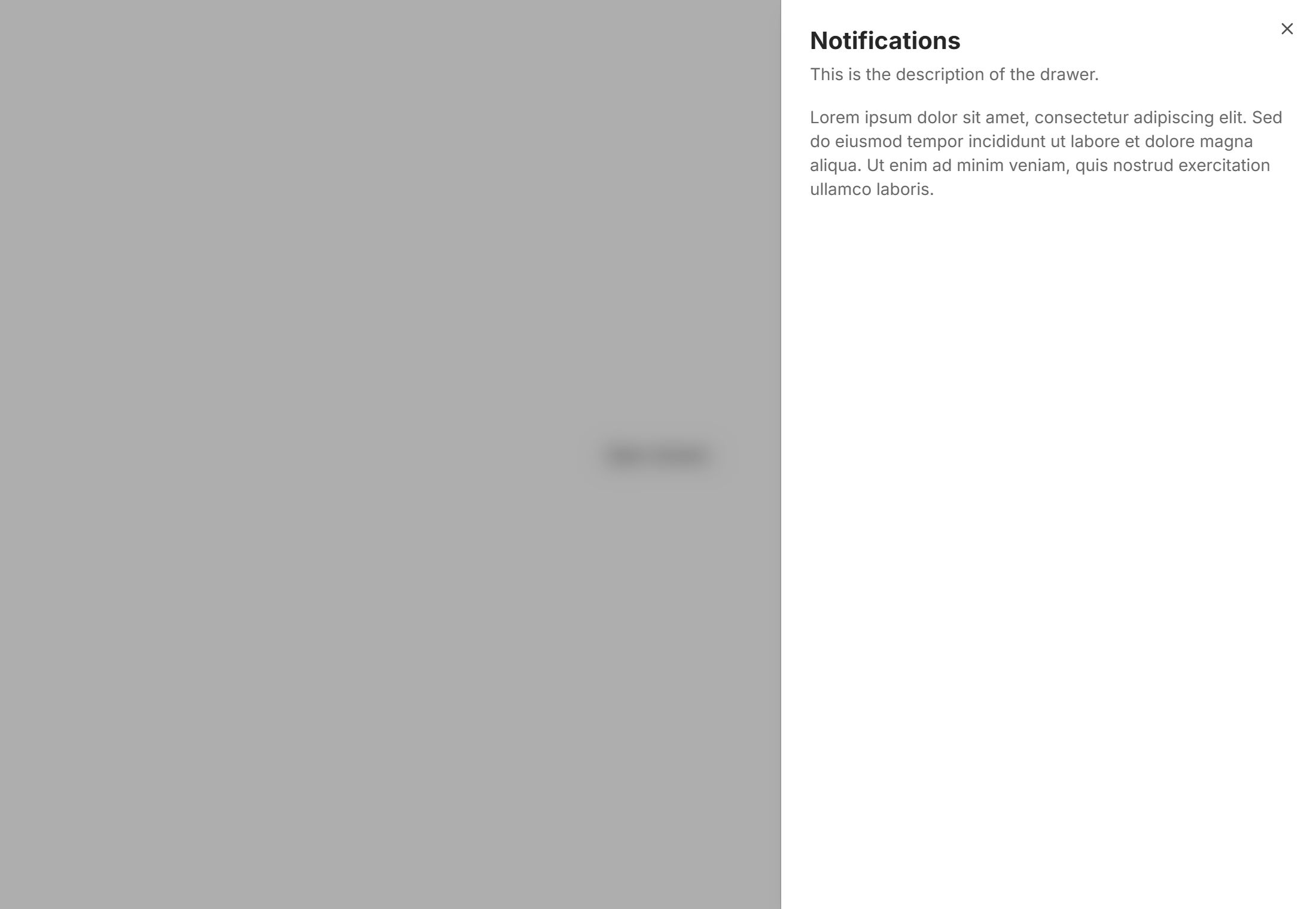
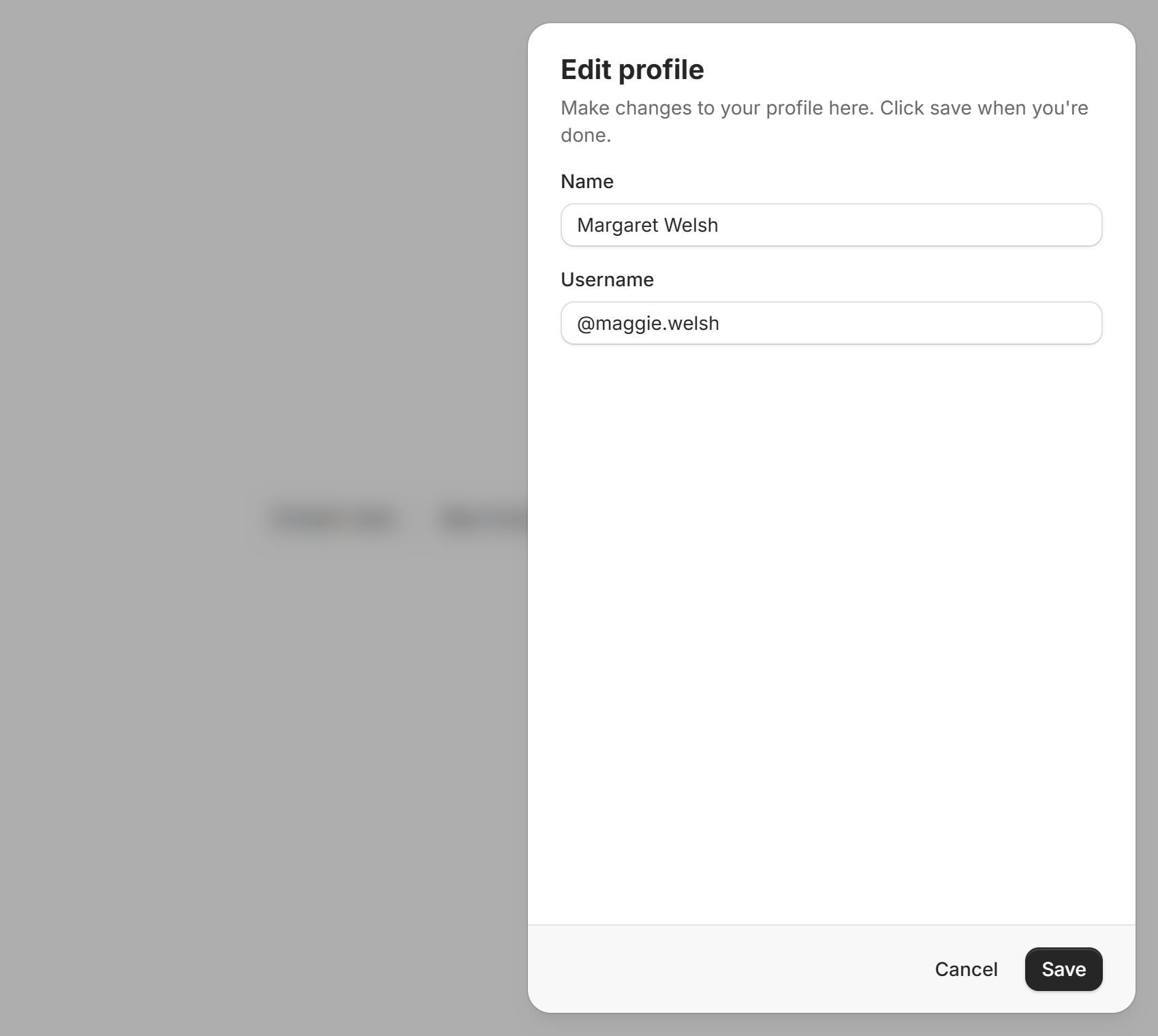
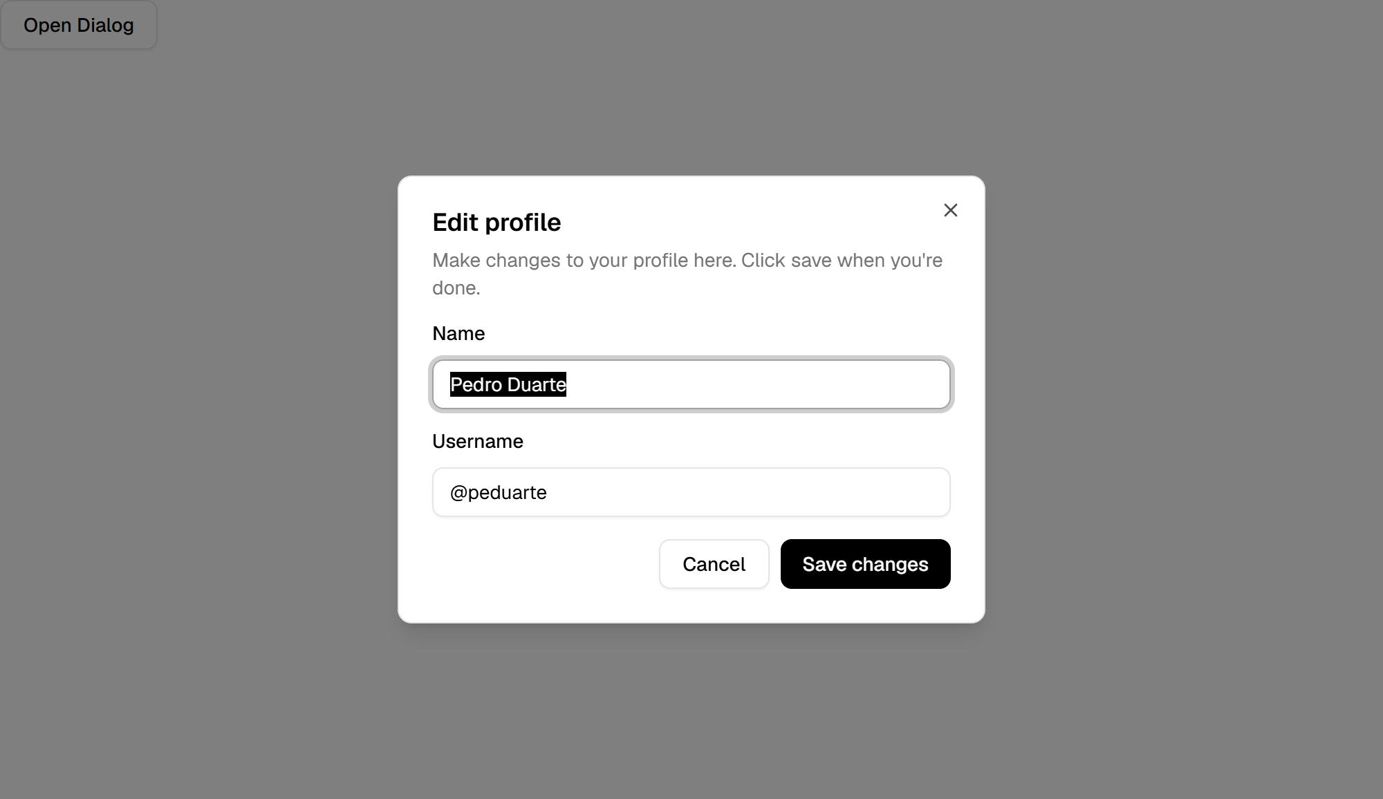
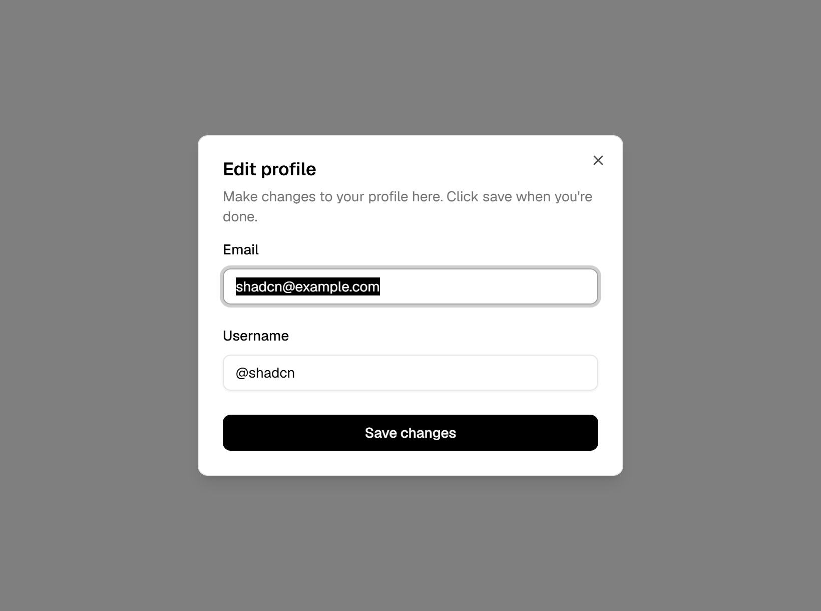
Overlays appear above the page: dialogs, drawers, sheets, popovers, tooltips, menus and context menus. Every SexyUI component is written for React and Tailwind CSS, follows shadcn/ui conventions, lists its dependencies, and ships with its original MIT licence notice.
Use it with a coding agent
Your agent can fetch this component as markdown in one request: GET /api/components/popover?format=md with your license key in the Authorization header. See llms.txt.